A Critique of an Oxy Student’s Course Registration Experience
Introduction:
Hello everyone. Today I will be critiquing the process that an Oxy student takes to register for classes. This period of time is imperative — setting a student up for graduating on time and navigating a student towards a subject they may want to study.
The experience of registering for classes is not exclusive to Oxy students. It is often a stressful process shared by students all over the world. Many different difficulties arise every year and term including inflation of students interested in a course, the absence or hiring of new professors, and the rise of registration priority that comes with becoming upperclassmen. Considering these factors and many others, the success of registering for courses varies for each student every term.
This critique will aim to cover all aspects of the registration process, including multiple sites that Oxy students choose to personally use to organize their experience. I am doing this critique to dissect this significant practice of a student’s life to then find ways to improve the process to become quicker and less confusing. Based on the interviews with students that I’ve conducted, the whole experience of registering for classes requires a lot of backtracking, many windows and tabs, and repetitively perusing through courses on Course Counts. In addition, I am choosing to do this critique for my own sake. I think that registering for courses takes the labor of many sites that often confuse myself what courses I was going to look at or what CRNs I meant to jot down. It is a largely varied process at that, and I think that it would be interesting to critique it to better understand what makes the experience more steps than it should be.
Users and Goals:
I am doing this critique on the basis of finding the range of extents Oxy students go to compensate for confusions that arise in the course registration process at the beginning of each semester.
I aim to focus on several things including:
- What sites students use to complement Oxy registration sites
- Adaptations to certain confusing web features
- Frequency of switching between tabs to accomplish a task
I have chosen these focuses because I believe that many of the interviewees expressed frustration with the longevity of the course registration process. This stems from the fact of consistently having to change their locations in sites in order to complete several tasks. For example, if they wanted to check courses offered in two or more different subjects, they would have difficulty with the task of comparing the times of the courses in these subjects without changing the current location they were in on the site.
The course registration process urges the constant action of multi-tasking which I think manifests in these focuses of switching between several sites frequently.
The common goal of a student in the course registration process is as follows:
To register for classes that match the student’s personal academic interests, the student’s major’s requirements, and the schools’ core requirements on a track that will allow the student to graduate on time (for an average student this may mean 4 years/8 semesters).
Critique and Suggestions:
From the several interviews that I conducted, I have summarized the sites that Oxy students often use:
- Occidental College’s Course Counts site
- Occidental College’s certain major requirements pages
- Occidental College’s myOxy site
- RateMyProfessors
- Google Sheets
The sole confusion seems to commonly stem from the frequent use of Course Counts. But, we will get there soon.
I found that the course registration process commonly starts with finding what courses to take. This is expressed as a visit to the myOxy site.
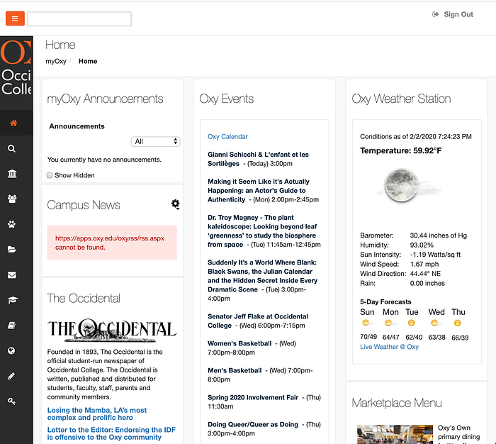
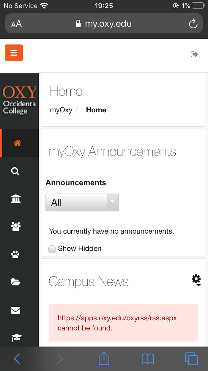
Once the user reaches this site, you would have to press Student Services to find your course history. This is where a problem comes into play. On the desktop version of this website, labels can appear with the symbols on the left-hand side (you can view the symbols in the images above) if your window is stretched wide enough. However, when considering how common it is for a student to have multiple sites open it is no surprise that a student may use the split-screen feature. This exposes the frustration that my interviewees faced.
“Sometimes I have to guess which symbol I should click to get to my course history.”
When using myOxy on an iPhone or on a laptop (with the window narrowed), the symbols on the left-hand side become a guessing game. For the sake of accessing a student record, it can be guessed that one should press a button that relates to this academic accordance. However, this understanding could be applied to many of the buttons including the graduation cap, pillars, and the silhouette of people. The conceptual model that is built in the user’s head is an understanding that the associations that the symbols represent will produce related results. But, since the icons can subjectively represent different things for many people, the way to get to a student’s academic record may cost a few more student clicks to get to Academics. The feedback of the wrong site reached teaches the student that they clicked the wrong symbol. This shows that the feedback is not accurately expected in a user’s conceptual model.
Once “Academics” is pressed, you are presented with links.
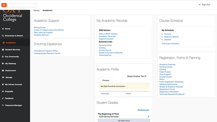
When “Grades & Academic Records” is pressed, you can press “Core Requirements” to find the courses you need to complete and have completed.
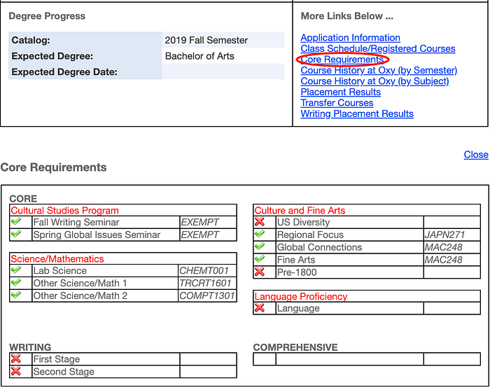
This shows one aspect of Oxy sites that seemed clear enough for the user. When pressing a button to find a record of classes, you can view the record of classes in the same window while still having the ability to look at other options that you can click (i.e. “Course History at Oxy (by Semester)).
This is a feature that shows a clear vision of recording the history of options clicked in a student’s experience with searching for different courses during the registration process.
After interviewing and comparing the interviewee’s frustrations, I found that this feature (explained above) found in the current functionality of accessing “Core Requirements” could be useful in Course Counts.
The process of accessing “Core Requirements” was often supplemented with the student visiting their major’s requirements on the Occidental College site and their own personal location of tracking courses they want to take. Varying by the user, students chose Google Sheets, the Notes app, and/or the Stickies app to track courses they hear of throughout the year for course registration.

When interviewees talked about visiting this page to find the requirements for their major they said:
“My major is pretty straightforward and all of my requirements are explicitly shown on the site, so I’m not really confused when going into the meeting with my advisor.”
When evaluating the site for multiple majors, the way that the major requirements are visualized is pretty straightforward. However, when considering the cost of accessing this information in accordance with Core Requirements and actually registering for courses, I think that this information could be condensed. In other words, I think that it would be useful to have a button in the “Grades & Academic Records” section of myOxy to also have a list of pending requirements for one’s major. I believe that this method would map the goals of finding course requirements more organized. Therefore, a student could access the big umbrella of course requirements (core and major) in one location.
Then, the student goes to the “ADD or DROP classes” section of their myOxy.


Due to the fact that it is past the registration period, I cannot access what the site looks like when we can register for classes. In a nutshell, several empty text boxes are shown on the bottom of the site. This is where a student can type in the CRNs of the courses that they want to add to their course list. On the top of the text boxes is a list of courses that student has already registered for. This way, a student can track the current courses that they were able to successfully get into.
In addition, the student usually also opens Course Counts.
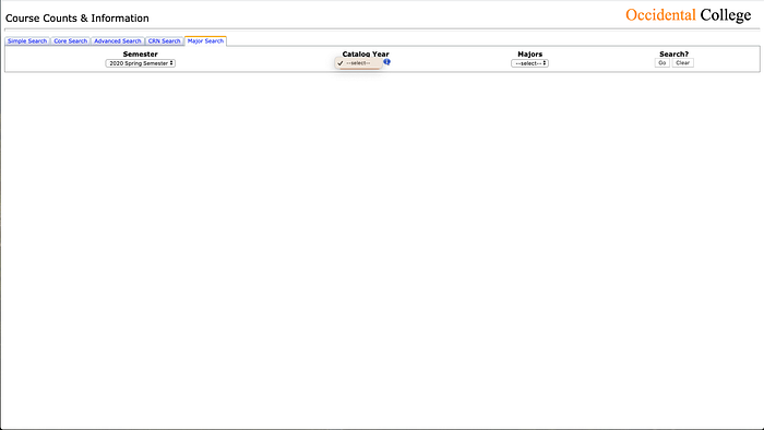
According to the interviewees, the most commonly used tabs were the “Simple Search”, “Core Search”, and “Advanced Search” tabs. Upon exploring Course Counts’ tabs, I found that the last tab, the “Major Search” tab, is defective. This is is a constraint on the functionality of that tab.
Students often said that they prioritized their classes as follows:
- Professor
- Time
- Class
(Time and Class were often interchanged)
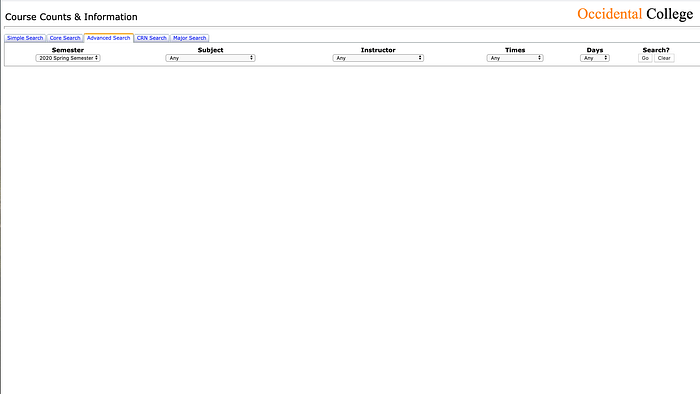
When considering the tabs offered by Course Counts, it is quite useful to use “Advanced Search” because it accounts for specific wants such as the time of classes.
When looking at the courses that they want to take or are required, students check RateMyProfessor.com to check public ratings of certain professors at Occidental College.
“It is a significant indication of how well I think I’ll do in class.”
Checking the quality of the professors deemed to be very important when considering what classes to take, which made RateMyProfessors a very important site of use.
While crosschecking courses offered during a particular semester, sites like RateMyProfessor, myOxy, and their major’s requirements (on Occidental College’s main site, oxy.edu), the student starts jotting down the CRNs of courses that they think will register for. They usually jot these CRNs down on a Notes window or a piece of paper since they are subject to change when meeting with an advisor or finding that the class is full.
Organizing an imagined schedule also comes in the form of visiting a site such as Coursicle.com.

Coursicle was not a common use but seemed to be a very valuable tool for the student that I interviewed. Coursicle allows you to visualize any possible clashes of classes time-wise. In addition, it allows you to create multiple schedules if a student is not sure that they will get all the classes that they need in one schedule.
When a student meets with their advisor and learns that their advisor disapproves of their ideal schedule, the student goes back to Course Counts to find alternative courses. Students have experienced this when advisors tell the student that their ideal schedule is too difficult to handle or not realistic when considering the desired completion of a second major or minor.
Regardless, students adapt and find new classes that could fulfill a certain interest of theirs or another requirement. It was commonly shared that students want to fulfill their core requirements before taking major-specific requirements. This allows a “freer schedule” with greater specificity of class selection considering a more mature schedule of major-specific classes in the future.
When using Course Counts, the most expressed frustration was associated with the toggling of courses.
“I have to have 500,000 tabs of Course Counts open careful to not refresh my tab, close something, or lose a course that I’m looking at…it’s annoying.”
“I usually have a google sheets open where I just copy down all of the course’s details because I don’t like how Course Counts looks.”
The two quotes above show adaptations that students have become accustomed to when using Course Counts…and rightfully so.
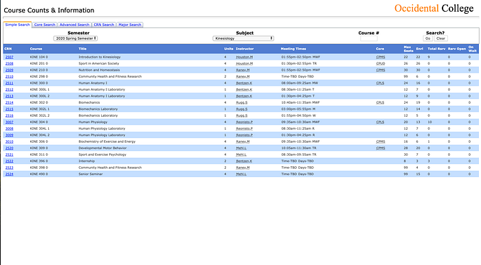

When you press a course on the Course Counts page, the user is presented with a whole window that explains the course. As you can see, this window takes up the whole page. You can no longer view other courses from the subject that you had selected. This becomes an annoyance because it prompts the user to create another tab of Course Counts to then save the details of a course and to compare it to another details page of a course.
The only way to cancel out of the course details is the red ‘X’ circled in the image above. According to my interviewees, it is a common occurrence that they end up pressing the back button in the browser (also circled in the image above) and end up going back a site (usually Google). This forces the user to repeat the process of navigating Course Counts to a specific course. The red ‘X’ is often forgotten, painting a false conceptual model in the user’s mind. Since the browser’s back button has become a standard convention of going back to the previous location (URL) on a site, it translates to the user’s interaction with Course Counts. However, when a course is pressed, it isn’t going to a second URL on the site. It acts as a pop-up window within the page. This differentiation should be made more clear with actual pop-up windows that are separate from the current page. This way, a student could browse a selection of courses, click on interesting courses and search through the pop-up windows while still visibly being able to search through alternative courses. In addition, it would reduce confusion with the functionality of the effects of closing a window without backtracking too far.
What was suggested by my interviewees and I, in agreement, was that it would be useful for course details to be shown in a way that didn’t constrain a user from looking at other courses under the same subject. Similar to the construction of the myOxy “Grades & Academic Records” section, the ability to toggle between button details and other buttons created a clear point of navigating different information.
When inputting CRNs into the actual registration site, students varied in putting all of their CRNs at one time or putting in their CRNs one at a time. This allows their registration to happen methodically by priority. By priority of class, they are able to guarantee what classes they can get in first so that registered classes don’t coincide with each other. It would be useful for the registration site to allow students to visualize their courses such as the Coursicle tool does. It is easier to understand visually than in written points. And if a student can visualize their schedule, there can be less room for error when students consider their schedule outside of class.
When interviewing students, they expressed different thoughts towards the times that they preferred their classes. Some preferred their classes right after each other while others preferred classes after 9:30 am for personal preference. The Course Counts site accounts for these personal preferences in their “Advanced Search” section but doesn’t provide a way to easily compare classes based on time or details. It rather urges the user to open another tab or window for comparison. This process isn’t necessarily taxing. However, when the process is done and a whole schedule of classes is compared and selected, there is no way to visualize all of the classes picked on Course Counts other than by the user’s own effort to track their courses on a Notes app or a piece of paper. I would suggest that Course Counts provides more options for organizing a schedule such as by providing a visualizer for a full schedule in order to track previously selected courses by time. This way, we can mitigate that confusion that was often expressed when avidly multi-tasking or cross-checking desired courses on multiple windows.
Summary:
This critique has taught me a lot about the Oxy course registration process. Considering the annoyances that arise when I use Course Counts, it was surprising to see that other students felt the same way. This solidified my own understanding of how confusions with interacting with sites are not unique to me. Other students experience it, which urges me even more to fix the site of its quirks.
To add, I developed my use of HCI terms and consideration of what HCI problems really are when writing this critique. To conclude, the problem is not simply the frustration of students when using sites like myOxy and Course Counts. Defining a problem can be very tricky, so to tread lightly, I would define the issue with course registration as a culmination of organizing a student’s multi-faceted approach to registering for courses. It is not an experience that simply requires a student to look at a course they like and to immediately register. It requires the constant tracking of their footprint of discovering courses that are required of them and that they are interested in within the boundaries of time and availability. If a course is full or doesn’t fit a schedule, students find an alternative class. If Oxy’s sites can be flexible to the point of aiding a student’s way of organizing their schedule, the process could be less taxing on the student — especially considering the constant cross-checking that happens. This is why I chose to suggest condensed versions of web features and added organization tools (i.e. schedule visualizer).
I hope readers can take away a reflection of their own way of dealing with scheduling experiences online, and how they can organize the process better. Even with categorizing and prioritizing certain subjects, it is quite baffling to see how many sites I end up visiting for my own course registration.
